Introduction 00:00
Creating a Three.js scene is already super simple with R3F, but it’s going to get even simpler.
One of the advantages of React is the ability to make things reusable. R3F took advantage of that and developers are creating many components (called helpers) ready to be used in your R3F application.
It could be about almost anything. Here are some examples:
- Camera Controls
- Complex geometries
- Post-processing
- HTML implementation
- Loaders
- Environment settings
- Complex calculations
- Etc.
Some of those helpers can be added as components (<theHelper>), some as hooks (useHelper) and you can find most of them regrouped in drei (Three in german, pronounced /dʁaɪ̯/).
First, you should pause the lesson and check them all (no kidding).
You don’t have to test them in depth. The idea is that you discover them so that, at some point, if you need one, you’ll know these possibilities exist. Otherwise, you might end up re-inventing the wheel.
Still, we are going to discover some of them right now to get a good idea of the potential and we are going to use some more in the next lessons.
Setup 03:16
The setup is very similar to the previous lesson with a sphere, a cube and a floor.
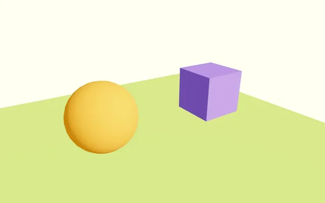
There is also a directional light source and an ambient light source.
The cube isn’t animated and the camera is being handled by the <orbitControls>.
OrbitControls 03:51
The first helper we are going to install, is OrbitControls.
You might think that we already have it, and while that’s true, using this helper will make things easier and will grant us access to features that we haven’t activated yet.
In Experience.jsx, remove the current OrbitControls, the extend, the <orbitControls> component and useThree:
export default function Experience()
{
    return <>

        <directionalLight position={ [ 1, 2, 3 ] } intensity={ 4.5 } />
        <ambientLight intensity={ 1.5 } />

        <mesh position-x={ - 2 }>
            <sphereGeometry />
            <meshStandardMaterial color="orange" />
        </mesh>

        <mesh position-x={ 2 } scale={ 1.5 }>
            <boxGeometry />
            <meshStandardMaterial color="mediumpurple" />
        </mesh>

        <mesh position-y={ - 1 } rotation-x={ - Math.PI * 0.5 } scale={ 10 }>
            <planeGeometry />
            <meshStandardMaterial color="greenyellow" />
        </mesh>

    </>
}
The starter could have been set like this, but I wanted you to see how much easier it’s going to be.
Now, we need to access all those drei helpers.
To do that, in the terminal, install @react-three/drei with npm install @react-three/drei@9.108 (we force the version to prevent surprises; you can ignore potential vulnerability warnings).
As you can see, drei is part of the @react-three scope that we mentioned in a previous lesson.
In Experience.jsx, import OrbitControls from @react-three/drei:
import { OrbitControls } from '@react-three/drei'Now add <OrbitControls> anywhere in the JSX:
export default function Experience()
{
    return <>

        <OrbitControls />

        {/* ... */}

    </>
}
See how convenient it was?
We removed most of the code and added only two lines to get the OrbitControls working.
By default, the OrbitControls is also set with enabledDamping which makes the animation smoother. In addition, we don’t have to ask it to update itself on each frame like we used to in native Three.js.
If we want to disable the damping, we can do it like so:
<OrbitControls enableDamping={ false } />But let’s keep the damping and remove the enableDamping attribute:
<OrbitControls />TransformControls 10:39
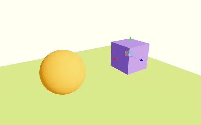
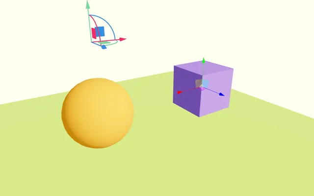
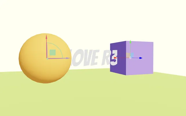
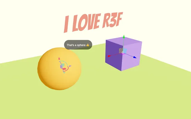
TransformControls adds a gizmo that allows the user to transform (position, rotation or scale) the object.
Import TransformControls from @react-three/drei:
import { TransformControls, OrbitControls } from '@react-three/drei'Wrap the <mesh> corresponding to the cube in <TransformControls>:
<TransformControls>
    <mesh position-x={ 2 } scale={ 1.5 }>
        <boxGeometry />
        <meshStandardMaterial color="mediumpurple" />
    </mesh>
</TransformControls>

But you might notice two bugs:
- The gizmo is at the center of the scene
- Moving it isn’t convenient because the camera moves at the same time
Fix the position
First, let’s take care of the position as we were expecting it to be on the cube.
When writing the <mesh> inside the <TransformControls>, R3F will actually create an object inside another object.
As a result, we are offsetting the one inside (the cube).
There are two solutions for this situation.
The first one would be to simply move the position-x attribute from the <mesh> to the <TransformControls>:
<TransformControls position-x={ 2 }>
    <mesh scale={ 1.5 }>
        <boxGeometry />
        <meshStandardMaterial color="mediumpurple" />
    </mesh>
</TransformControls>
Another slightly more complicated solution would be to separate them and re-associate them using a reference and an attribute.
Put back back the position-x on the <mesh> and separate the <TransformControls> by putting it after <mesh>:
<mesh position-x={ 2 } scale={ 1.5 }>
    <boxGeometry />
    <meshStandardMaterial color="mediumpurple" />
</mesh>

<TransformControls />
As I’m writing this lesson, adding the <TransformControls> before the <mesh> would work but it would also generate bugs later in the lesson.
Import useRef from react:
import { useRef } from 'react'Create a cube reference:
export default function Experience()
{
    const cube = useRef()

    // ...
}
Associate it with our <mesh> using the ref attribute:
<mesh ref={ cube } position-x={ 2 } scale={ 1.5 }>And then add it to the object attribute of the <TransformControls>:
<TransformControls object={ cube } />
A bit far-fetched, but still efficient and, most of the time, we need to add a bunch of references to our meshes anyway.
It also makes the cube <mesh> and its position independent from <TransformControl>. We can deactivate <TransformControl> without any side effect.
OrbitControls conflict
The other issue we’re experiencing, is that the camera is moving when we drag and drop our gizmo.
Fortunately, this case is already handled and all we need to do is add makeDefault to the <OrbitControls>:
<OrbitControls makeDefault />The OrbitControls will automatically be disabled when we interact with the TransformControls.
Modes
The mode is set as translate by default, but we can change it to rotate or scale with the mode attribute:
<TransformControls object={ cube } mode="rotate" />But let’s keep the translate for now by removing the mode attribute or setting it to translate:
<TransformControls object={ cube } mode="translate" />PivotControls 21:11
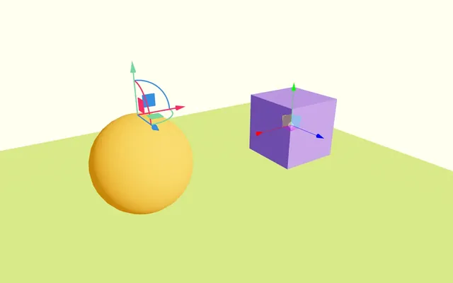
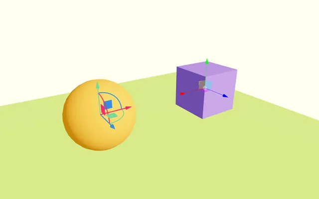
TransformControls is great and we’ve seen it around for quite some times. But not long ago, we got a new solution doing kind of the same thing but with different features and looking really good which is something that you might want if the controls aren’t just for debugging purpose, but also for the end user like if you want them to be able to move furniture or whatever.
And that solution’s name is PivotControls.
Import PivotControls from @react-three/drei:
import { PivotControls, TransformControls, OrbitControls } from '@react-three/drei'Wrap the orange sphere in a <PivotControls>:
<PivotControls>
    <mesh position-x={ - 2 }>
        <sphereGeometry />
        <meshStandardMaterial color="orange" />
    </mesh>
</PivotControls>
PivotControls doesn’t work as group like for the TransformControls. If we want it to be at the center of the sphere, we have to change its position using the anchor attribute.
The anchor attribute must be an array containing the position on all 3 axes (x, y and z).
Add the anchor attribute to <PivotControls> and set it to [ 0, 0, 0 ]:
<PivotControls anchor={ [ 0, 0, 0 ] }>
{/* ... */}
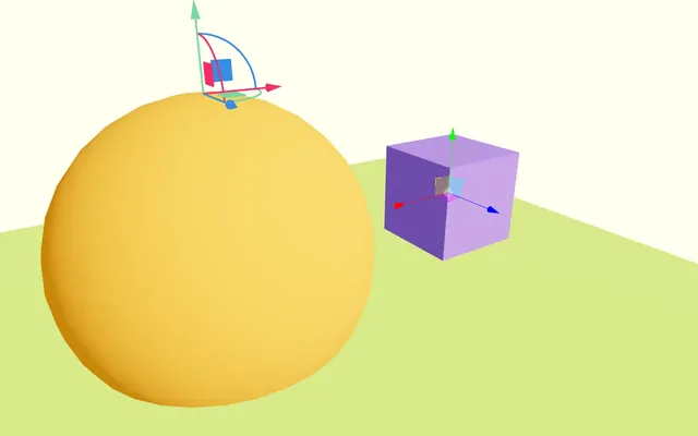
</PivotControls>But where is it now?
By default, the PivotControls visibility works like any object in the scene and will be hidden if it is behind other objects and it is currently inside the sphere.
To force it to render on top of the scene, we can use its depthTest attribute and set it to false:
<PivotControls
    anchor={ [ 0, 0, 0 ] }
    depthTest={ false }
>
    {/* ... */}
</PivotControls>
Let’s talk a bit more about the anchor.
We set it to [ 0, 0, 0 ] and it resulted with the pivot being at the center of the sphere.
The cool part of anchor is that the value is relative to the object itself. As an example, set the anchor attribute to [ 0, 1, 0 ]:
<PivotControls
    anchor={ [ 0, 1, 0 ] }
    depthTest={ false }
>
    {/* ... */}
</PivotControls>
Now change the scale of the sphere <mesh> and set it to 2:
<mesh position-x={ - 2 } scale={ 2 }>
As you can see, the <PivotControls> is still at the exact top of the sphere even though we haven’t change the anchor attribute.
Remove the scale attribute on the sphere <mesh>:
<mesh position-x={ - 2 }>
We can obviously set the anchor on the y and z axes:
<PivotControls
    anchor={ [ 1, 1, 1 ] }
    depthTest={ false }
>
    {/* ... */}
</PivotControls>
And go beyond the -1, +1 range:
<PivotControls
    anchor={ [ 0, 2, 0 ] }
    depthTest={ false }
>
    {/* ... */}
</PivotControls>
Let’s put it back at the center with [ 0, 0, 0 ] to have the <PivotControls> at the center:
<PivotControls
    anchor={ [ 0, 0, 0 ] }
    depthTest={ false }
>
    {/* ... */}
</PivotControls>
We can also control the look of it like the thickness of the lines with lineWidth, the color of the axes with axisColors or the size with scale:
<PivotControls
    anchor={ [ 0, 0, 0 ] }
    depthTest={ false }
    lineWidth={ 4 }
    axisColors={ [ '#9381ff', '#ff4d6d', '#7ae582' ] }
    scale={ 2 }
>
    {/* ... */}
</PivotControls>
By default, the <PivotControls> will have a perspective, meaning it’ll get smaller the further away from the camera.
We can change that and have always the same size by setting the fixed attribute to true, but doing so mean that the scale will be the pixel size of the PivotControls and 2px being a bit small, we should increase it too:
<PivotControls
    anchor={ [ 0, 0, 0 ] }
    depthTest={ false }
    lineWidth={ 4 }
    axisColors={ [ '#9381ff', '#ff4d6d', '#7ae582' ] }
    scale={ 100 }
    fixed={ true }
>
    {/* ... */}
</PivotControls>
Html 30:50
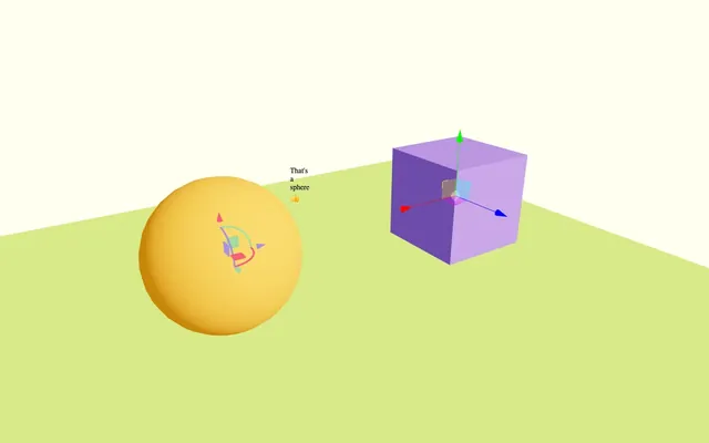
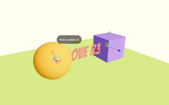
Html adds a DOM element that will stick to your object.
Import Html from @react-three/drei:
import { Html, PivotControls, TransformControls, OrbitControls } from '@react-three/drei'Add a <Html> anywhere in the JSX and write any text you want in it:
export default function Experience()
{
    // ...

    return <>

        {/* ... */}

        <Html>Test</Html>

    </>
}
You should see the “Test” text at the center of the scene and it’ll stay there even if you move the camera laterally.
We can also add it to a <mesh>, a <group> or anything that inherits from Object3D.
Let’s put it in the sphere <mesh>:
<mesh position-x={ - 2 }>
    <sphereGeometry />
    <meshStandardMaterial color="orange" />
    <Html>That's a sphere 👍</Html>
</mesh>
The text now sticks to the sphere.
We can offset it by changing its position like other components:
<Html position={ [ 1, 1, 0 ] }>That's a sphere 👍</Html>
Class and style
We can add style to it, but we are going to add a class first in order to target it in CSS.
To do that, add a wrapperClass attribute:
<Html
    position={ [ 1, 1, 0 ] }
    wrapperClass="label"
>
    That's a sphere 👍
</Html>
In style.css, can add some CSS by targeting the div inside .label:
.label > div
{
    font-family: Helvetica, Arial;
    position: absolute;
    background: #00000088;
    color: white;
    padding: 15px;
    white-space: nowrap;
    overflow: hidden;
    border-radius: 30px;
    user-select: none;
}
We can center it on itself with the center attribute:
<Html
    position={ [ 1, 1, 0 ] }
    wrapperClass="label"
    center
>
    That's a sphere 👍
</Html>
The pivot point of the DOM Element is now at its center.
We can simulate perspective with the distanceFactor attribute:
<Html
    position={ [ 1, 1, 0 ] }
    wrapperClass="label"
    center
    distanceFactor={ 8 }
>
    That's a sphere 👍
</Html>
And we can hide it, when objects are in front of it with the occlude attribute.
To use the occlude, we first need to have a reference to the various objects that can occlude the label.
We already have the cube reference, but not the sphere.
Create a sphere ref with useRef and associate it with the <mesh> using the ref attribute:
export default function Experience()
{
    {/* ... */}
    const sphere = useRef()

    return <>

        {/* ... */}

        <mesh ref={ sphere } position-x={ - 2 }>
            {/* ... */}
        </mesh>

        {/* ... */}

    </>
}
And now we can send an array to the occlude attribute:
<Html
    position={ [ 1, 1, 0 ] }
    wrapperClass="label"
    center
    distanceFactor={ 8 }
    occlude={ [ sphere, cube ] }
>
    That's a sphere 👍
</Html>
The label will be displayed and hidden automatically.
You can do much more with Html and you can read up on it in the drei documentation, but we are also going to use it in a later lesson.
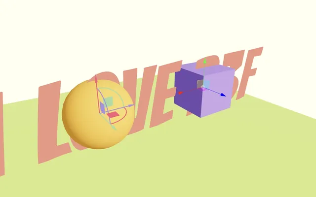
Text 41:47
We already know how to create 3D Text, but generating a 3D text geometry has its limits:
- We can notice the polygons.
- Generating the geometry takes a lot of CPU resources and the bigger the text, the longer it takes.
- Some fonts won’t look very good.
- It doesn’t support line breaks.
A good alternative is to use SDF fonts.
SDF
Although we don’t really need to understand the technique in order to use the helper, it’s a very interesting topic.
SDF stands for Signed Distance Field and is usually used in fragment shaders to draw shapes.
The idea is that we send a 2D or 3D point to a SDF shape function and that function returns how far that point is from the shape. There are many possible shapes, as long as they can be expressed mathematically.
Forget about the font and imagine that you want to draw a simple disc on a flat plane.
- We get the distance of the UV coordinate (the fragment we are drawing) to the center of the disc.
- We decide on a radius.
- If the distance we got earlier is less than the radius, we are in the disc and we can draw the pixel.
- If the distance exceeds the radius, we have moved beyond the disc and we draw nothing.
This is what we did in the Shader patterns lesson and this would be the SDF function to draw a circle.
It obviously gets more complicated for more complex shapes (especially 3D shapes).
Inigo Quilez (@iquilezles) wrote great articles with good examples of SDF functions:
SDF fonts
For fonts, it’s even more complex because the shape can’t really be calculated mathematically.
To fix that, developers have created scripts that generate textures containing the distance information for each character of a font.
We can then use that texture to indicate the distance between the fragment we are drawing and the supposed character.
If the distance is closer to a specific value, we draw the text; otherwise, we draw nothing.
You might think that it’s the same as drawing a text in a texture and using that texture, but it goes beyond that. The value we get is the distance between the point we are drawing and the character.
This enables things like easily changing the thickness of the font, adding a blur all around the font, drawing huge text, and having a lot of words while using the same collection of characters.
You might also think that we should still be able to see the pixels if the font distance is encoded in a texture, but the natural interpolation between pixels of a texture makes it almost unnoticeable unless the text is really huge or the encoded font resolution is too small.
The process of creating the texture from a font is long and complex. Fortunately, some developers have already done most of the heavy lifting in the Troika library (and more precisely troika-three-text) and drei is implementing that solution in the Text helper.
Again, although we explained how it works (at least on a superficial level), you don’t need to know that in order to use the helper.
Implementing
Import Text from @react-three/drei:
import { Text, Html, PivotControls, TransformControls, OrbitControls } from '@react-three/drei'And a <Text> anywhere in the scene (the content inside <Text> will be used as the text):
export default function Experience()
{
    // ...

    return <>

        {/* ... */}

        <Text>I LOVE R3F</Text>

    </>
}
The default font is Roboto and comes from the Google Fonts CDN, but we can provide another font like the one available in the /public/ folder:
<Text
    font="./bangers-v20-latin-regular.woff"
>
    I LOVE R3F
</Text>
Remember that files provided in the public/ directory are accessible as if they are in the same folder as the website, which is why we don’t have to write public/ in the path.
Troika supports woff, ttf and otf formats. If possible, you should use woff because it’s the lighter one.
If you have a font in a different format, you can try to convert it with:
To find new fonts, there are many websites, but if you like the Google Fonts collection, you’ll see that they are a bit hard to download as woff because Google fonts provide the format that suits your configuration and, most of the time, it’s woff2.
But there is a website called Google Webfonts Helper that will help you download the font you want.
Regardless of the solution you used for the font, don’t forget to check licenses if you plan on using any font online. Google Fonts are provided under SIL Open Font License 1.1 or Apache licenses, meaning you can download and use them freely.
We can change the size of the font and its color:
<Text
    font="./bangers-v20-latin-regular.woff"
    fontSize={ 3 }
    color="salmon"
>
    I LOVE R3F
</Text>
But a size of 3 is a little too big, so let’s put it back at 1:
<Text
    font="./bangers-v20-latin-regular.woff"
    fontSize={ 1 }
    color="salmon"
>
    I LOVE R3F
</Text>
We can also provide our own material:
<Text
    font="./bangers-v20-latin-regular.woff"
    fontSize={ 1 }
    color="salmon"
>
    I LOVE R3F
    <meshNormalMaterial />
</Text>
But let’s stick to the default one:
<Text
    font="./bangers-v20-latin-regular.woff"
    fontSize={ 1 }
    color="salmon"
>
    I LOVE R3F
</Text>
<Text> works like most objects in the scene and we can play with its position, rotation and scale:
<Text
    font="./bangers-v20-latin-regular.woff"
    fontSize={ 1 }
    color="salmon"
    position-y={ 2 }
>
    I LOVE R3F
</Text>
Text wrapping is also supported. We can limit the width to see the line breaks with the maxWidth attribute:
<Text
    font="./bangers-v20-latin-regular.woff"
    fontSize={ 1 }
    color="salmon"
    position-y={ 2 }
    maxWidth={ 2 }
>
    I LOVE R3F
</Text>
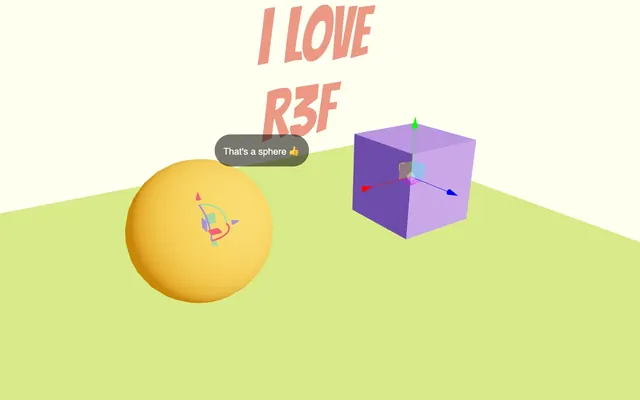
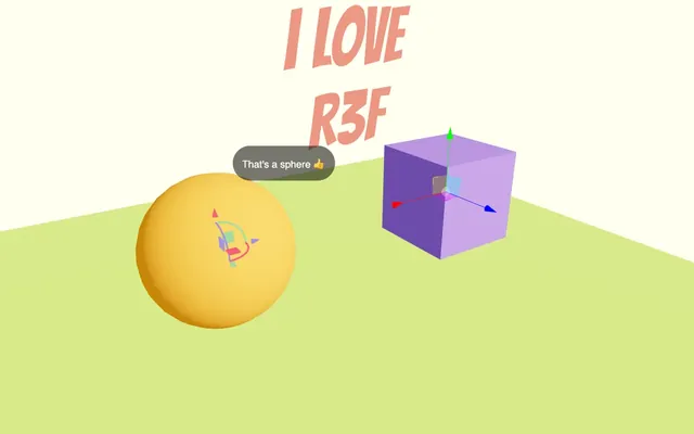
And we can center the text:
<Text
    font="./bangers-v20-latin-regular.woff"
    fontSize={ 1 }
    color="salmon"
    position-y={ 2 }
    maxWidth={ 2 }
    textAlign="center"
>
    I LOVE R3F
</Text>
We are going to stop here for the Text, but make sure to check the troika-three-text documentation if you want to learn more about features like stroke, blurred blur, etc.
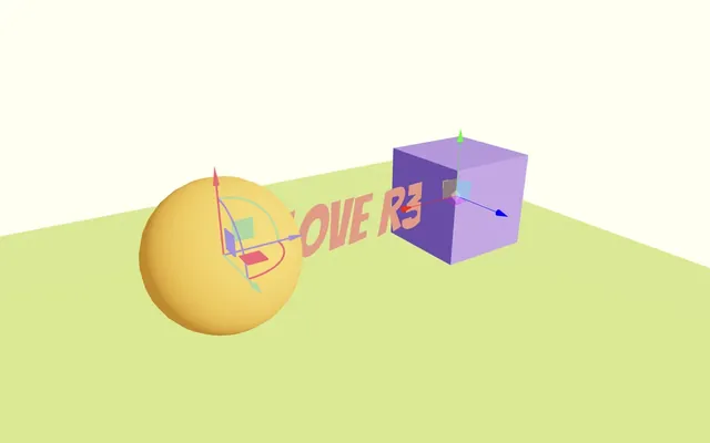
Float 01:06:54
The next feature is an easy one.
If you want to make something float like a balloon in the air or the overboard from Back to the Future, you can use the Float helper.
Import Float from @react-three/drei
import { Float, Text, Html, PivotControls, TransformControls, OrbitControls } from '@react-three/drei'Add it around the <Text>:
<Float>
    <Text
        font="./bangers-v20-latin-regular.woff"
        fontSize={ 1 }
        color="salmon"
        position-y={ 2 }
        maxWidth={ 2 }
        textAlign="center"
    >
        I LOVE R3F
    </Text>
</Float>
Then we can play with its attributes like speed:
<Float
    speed={ 5 }
>
    {/* ... */}
</Float>
Or floatIntensity:
<Float
    speed={ 5 }
    floatIntensity={ 2 }
>
    {/* ... */}
</Float>
MeshReflectorMaterial 01:08:38
Reflections in WebGL are always complicated, but MeshReflectorMaterial isn’t.
Import MeshReflectorMaterial from @react-three/drei:
import { MeshReflectorMaterial, Float, Text, Html, PivotControls, TransformControls, OrbitControls } from '@react-three/drei'Replace the <meshStandardMaterial> of the floor with <MeshReflectorMaterial> (in PascalCase) without the color attribute:
<mesh position-y={ - 1 } rotation-x={ - Math.PI * 0.5 } scale={ 10 }>
    <planeGeometry />
    <MeshReflectorMaterial />
</mesh>
And that’s all it takes to add reflection on a <mesh>.
Be aware that this technique is a bit limited and won’t work well with non-planar meshes.
Let’s tweak it a little.
Set the resolution attribute to 512 to improve the quality:
<MeshReflectorMaterial
    resolution={ 512 }
/>

Set the blur to [ 1000, 1000 ] and the mixBlur to 1 to make the reflection blurry:
<MeshReflectorMaterial
    resolution={ 512 }
    blur={ [ 1000, 1000 ] }
    mixBlur={ 1 }
/>

Add a mirror attribute of 0.5 to make the reflection clearer:
<MeshReflectorMaterial
    resolution={ 512 }
    blur={ [ 1000, 1000 ] }
    mixBlur={ 1 }
    mirror={ 0.5 }
/>
Add the color back in if you want to add a tint to your plane:
<MeshReflectorMaterial
    resolution={ 512 }
    blur={ [ 1000, 1000 ] }
    mixBlur={ 1 }
    mirror={ 0.5 }
    color="greenyellow"
/>

As always, there is a bunch of other attributes; feel free to check them out.
Going further 01:12:41
We’ve seen some very interesting helpers and how easy it is to add them. But we haven’t dug too much into the many helpers available and even the parameters of each helper we saw.
In the next lessons, we are going to use some of those helpers, but also discover a bunch of new ones. But remember to check them all so that you are aware of their existence in case you need them.
By the way, if you have ideas for new helpers or you are creating helpers for your personal projects and want to share, don’t hesitate to propose them to the drei repository. You are one pull request away to help many developers.